Sunday, August 7, 2016

Italian Centenarians

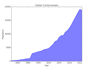
Being centenarian is getting easier in a way I didn't expect. Don't you believe it? Have a look at this:

Data are coming from ISTAT, the Italian Institute for Statistics and shows how centenarian people boomed in Italy in the last decades.

The cool thing about it, especially if you are not Italian, is not much in the information you get but in the way I created the picture. Starting from the rough data, using python and the matplotlib library.

Here is the source code:
import matplotlib.pyplot as plt # 1

# 2
years = [
    1982, 1983, 1984, 1985, 1986, 1987, 1988, 1989, 1990, 1991,
    1992, 1993, 1994, 1995, 1996, 1997, 1998, 1999, 2000, 2001,
    2002, 2003, 2004, 2005, 2006, 2007, 2008, 2009, 2010, 2011,
    2012, 2013, 2014, 2015, 2016
]
population = [
    302, 229, 345, 368, 482, 649, 703, 922, 960, 1120,
    2852, 3053, 3273, 3562, 3690, 4015, 4377, 4516, 4765, 5435,
    6153, 7265, 7614, 8797, 9470, 9470, 10728, 11319, 12243, 13544,
    15029, 16390, 17884, 19095, 18765
]

plt.plot(years, population) # 3
plt.xlabel('Year') # 4
plt.xlim(years[0], years[-1]) # 5
plt.ylabel('Population')
plt.title('Italian Centenarians') # 6
plt.fill_between(years, population, 0, color= 'blue', alpha= 0.5) # 7

plt.show() # 8
1. This is the standard way to import the pyplot sub-package. No one want to bring a long such long name, so the plt moniker is used instead.
2. If you don't believe me, you can get the data by yourself from ISTAT. Demography are from demo.istat.it.
3. I say to pyplot that I want to plot my data as a continuous line putting years on the X axis and population on Y.
4. Let the viewer better understand what's going on, showing a descriptive label.
5. Trim the picture so that it starts on the left with the first year and end to the right with the last one. Pyplot likes to let some room around.
6. It is always a good idea to give a name to the picture.
7. A nice touch, a bit of color to improve the readability.
8. After anything has been set on the area, it is time show it. This is the moment the image is actually generated.

Friday, August 5, 2016

Who is going to have dessert?

In the previous post We have seen how easy is to calculate the BMI for a bunch of people when using numpy arrays. Let's go a step further and use those data.

Given a BMI numpy array, let's check which element is fit enough to stand a dessert. Basically, what we want is getting a boolean array where True means that the associated guy has a BMI less than 25. Easier to write the Python code than explain it:
   import numpy

   # ...
   # given bmis, a numpy array containing BMI for each person under surveillance

   dessert = bmis < 25
Now, if we want to check if Person One could get a slice of cake, we can just check the relative element in the numpy dessert array:
   if dessert[1]:
      print('Enjoy the dessert!')
   else:
      print('No dessert for you!')

Calculating Body Mass Index

The Body Mass Index is a good tool to estimate the body fat for a person from their height and weight. It is quite easy to calculate:
   bmi = weight / height ** 2
Things are getting a bit more complicated if I want to get the BMI for a bunch of people. I'd like to write something like this:
   bmis = weights / heights ** 2
Problem is that I can't do that with standard python lists, since there is no overload for mathematic operators working on them. I should write a piece of code that works on single components and puts the result in another list.

Luckly I could use the numpy library, designed expressly to provide better numeric capability to python. It is just a matter of using the array class. Here is an example:
   import numpy

   heights = numpy.array([1.78, 1.52, 1.63, 1.68])
   weights = numpy.array([65, 82, 63, 65])
   bmis = weights / heights ** 2

   print(bmis)

Monday, April 18, 2016

Saving R plot to png

On Linux, if we want to save a plot to file we have to do specify before plotting to which file and in which format we want to work.

Say that I want to generate a PNG named myPlot.png in my current directory:
png('myPlot.png')
plot(df$var1, df$var2)
dev.off()
The last line says to R that I want to switch back to the default, meaning X11 that is going to show my up the result.

Sunday, April 17, 2016

Simple data manipulation on a R data frame

Given a data frame df with a variable named Var, to extract the vector containing all the observations for that variable I should use the dollar sign to connect dataframe to its variable:
df$Var
Now, for that variable I can get its mean:
mean(df$Var)
Standard deviation:
sd(df$Var)
Summary (that works also for a complete data frame):
summary(df$Var)
Which observation has the minimum value for the passed variable:
which.min(df$Var)
Which observation has the maximum value for the passed variable:
which.max(df$Var)

It is easy to generate a scattered plot that correlates two variables in a data frame:
plot(df$Var1, df$Var2)
Here Var1 would get the X axis while Var2 the Y axis.

We can extract a subset from a dataframe evaluating conditions on one or more variables:
sub = subset(df, Var1 > 100 & Var2 < 50)
Notice that the AND logical operator is an ampersand. To see how many observations are in this subset (and in any dataframe) we can use the nrow function:
nrow(sub)

To generate an histogram in R we use the hist() function. The boxplot() function generate boxes, that are quite useful to see the statistical range of a variable.


Reading and writing CSV files in R

Before loading a file in R is often useful change directory in the environment, this is done by:
setwd('pathname')
If you have a doubt about which is your current working directory, just print it:
getwd()
Reading from a CSV file to a data frame is pretty simple:
df = read.csv('path/to/file.csv')
Now we can get the structure of the dataframe:
str(df)
It gives us information on the number of observations (rows) and variables (columns); names of variables, a few of their values and, when they are detected as 'factors', also the number of 'level'on which that variable is structured.
Another useful function is:
summary(df)
It tries to provide us useful summary for each variable, giving the levels in case of factor, or a few statistic measures otherwise (min, max, mean, median, first and third quartile).

We can create a subset from a dataframe selecting a specific value for a variable, like this:
sub = subset(df, MyVariable = 'a value')
Then we can save this subset to a CSV file:
write.csv(sub, 'path/to/subFile.csv')

Localization problems in R

Just a hint. If you see your R environment behaving strangely, it could be a problem of localization.

Look for the Sys.getlocale function in the R documentation, here is a handy link, courtesy of the Zurich polytechnic.

For my case, to solve the problem I called:
Sys.setlocale("LC_ALL", "C")